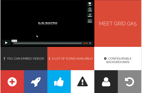
News Show Pro GK5 is the next generation of our best module for presenting articles in both Joomla! 2.5 and Joomla! 3.x. Huge amount of options and possibilities of formatting causes NSP GK5 is a complex tool in making www pages content attractive. Module is appropriate while preparing simple structures with an individual article, the same as, complex arrangements including few articles and a list of links. That’s why we use this extension regularly in our Joomla! templates. Of course you can use this module also with others not only Gavick templates also multilingual.
In this article we have described also few tips associated with its customization & translation, for example, how to change label or add titles (check at the bottom). Version 1.4.0 also introduces several new features, created based on feedback from our users; you can see these new features in action in our latest template for information portals, News 2.
In comparison with NSP GK4 brings a lot of changes. The newest version of our News Show Pro GK5 module, the most advanced content-display module available for Joomla, includes a host of great improvements and fixes.
Module configuration
Those used to our NSP GK4 release will notice that the administration panel of module has been redesigned. Although the main options group has not changed, new options and parameters have been added.
List of content:
Extra Tips:
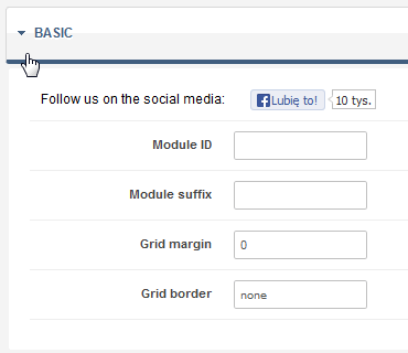
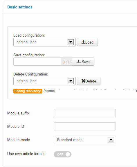
Basic Settings – “Basic” tab
![b-settings]()
One of the most useful new features of Basic Settings is the option to save and load module configuration. This makes it possible to save your NSP configuration and, if needed, to load and restore settings. Configuration files are saved in a config catalog for the module. If saving with an already-existing file name, a number will be appended to the filename to make it unique. You can also delete configuration file, if you don’t need it anymore.
The “Module ID” option allows you to specify your own static module ID. If this option will be blank then the automatic module ID will be created.
A predefined module style: Standard mode, News Blocks, News Gallery, Portfolio, Video Gallery, Video List, Product Gallery, Title Overlay or Highlights – may be selected using the “Module mode” option.
When “Use own article format” option will be enabled then the module uses to generate article structure the code from folder article_formats. Remember that the file with the code must be selected from the list in the ‘Article Format’ section. In the Article Formats, since version 1.3, a few new tags for K2 items have been added: {TAGS}, {VIDEO_HTML} and {CATEGORY_IMAGE_SRC}, additionally the {DATE} variable now gets format from information block settings. And since version 1.4.1 in the info blocks you can use the %CART and %PRICE tags if K2Store component is installed and used.
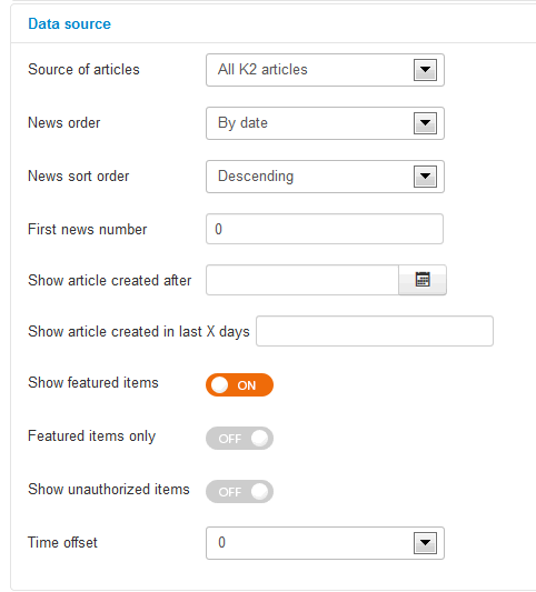
Managing content source – “Data Source” tab
![data-souce-gk5]()
Parameters connected with the choice of type of data source used for generating module content and its filtering. Data source can be:
- Joomla! Content (categories or articles).
- K2 Content (K2 items, K2 categories, K2 Tags or K2 Authors).
- Virtuemart (products or categories)
- HikaShop (products, categories)
- Easy Blog (articles, categories, tags or authors)
- JSON file
- RSS feed
- XML file
In the case of categories, you can choose categories from multiple choice list (use CRTL key) whereas when you want to present articles chosen.
In the next versions of the NSP GK5 module, we plan to implement more supported popular components.
The “News order” options are for specifying the way of sorting articles from few possibilities: date, title, ID item order, randomize or hits amount.
The “First news number” is used to show articles from a range specified, this option gives possibility to show, e.g. articles starting from fifth article (if value = 5).
The “Show article created after” allows you to show articles created after specified period of time. That’s why it’s possible to specify the oldest article/items to be presented.
The “Show article created in last X days” – is used to show articles from a specific date range (last 7 days, last 30 days or more days).
The “Show featured items” – allows you to enable showing featured articles/items or to show only them.
The “Show unauthorized items” – allows you to disable showing unauthorized items.
The “Time offset” option is useful only when you have a problem with time zone between your location and your hosting location (i.e. when new articles are showing with few hours delay).
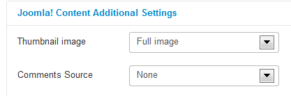
Joomla! Content Additional Settings
![joomla-content-settings-gk5]()
The “Thumbnail image” option allows to select whether thumbnails are generated from intro or full article image. The available options are: Intro image, Full image or Use first article image.
The “Comments Source” -option allows you to specify the comments source for the Joomla! Content (None or Komento component).
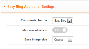
Easy Blog Additional Settings
![easyblog]()
The “Comments Source” option allows you can specify the comments source for the information block (Easy Blog or Komento).
The “Hide current article” option if enabled it hides the currently displayed article from the module – use it if you want to avoid duplicated content on the specific subpages.
The “Base image size” option allows you to select the base size of the source image (Original, Thumbnail or Icon).
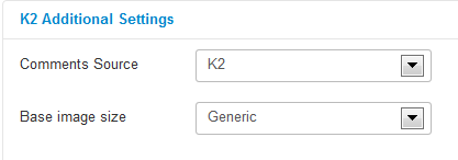
K2 Additional Settings (tab)
![k2-add-settings-gk5]()
The “Comments Source” option allows you to specify the comments source for the information block (K2, Jcomments or Komento).
The “Base image size” option allows you to select the base size of the source image. Those sizes are connected with K2 Image Parameters, the available options are: Generic, XSmall, Small, Medium, Large and XLarge.
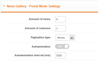
News Gallery – Portal Mode Settings (tab)
![News Gallery - Portal Mode Settings]()
News Gallery – Portal Mode Settings
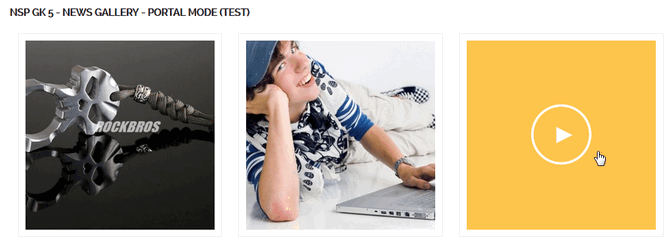
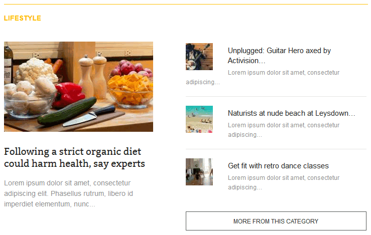
This mode is good if you want to show only images from selected Joomla! articles or K2 item and they would be link to those sources. It doesn’t show any other information blocks like title or comments. This style use nice “>” icon after mouse rollover on image. Remember to enable Use default CSS option in External files tab in you want to have following appearance.
![Example]()
Example of News Gallery mode (images in 3 columns)
The “Amount of news” – allows you to specify amount of news (articles/k2 items) to show.
The “Amount of columns” – this option specify amount of news columns displayed in the portal mode.
The “Pagination type” – this option allows you to select what kind of pagination you want to use (Arrows or Pagination dots)
The “Autoanimation” – allows you to enable or disable animation effect.
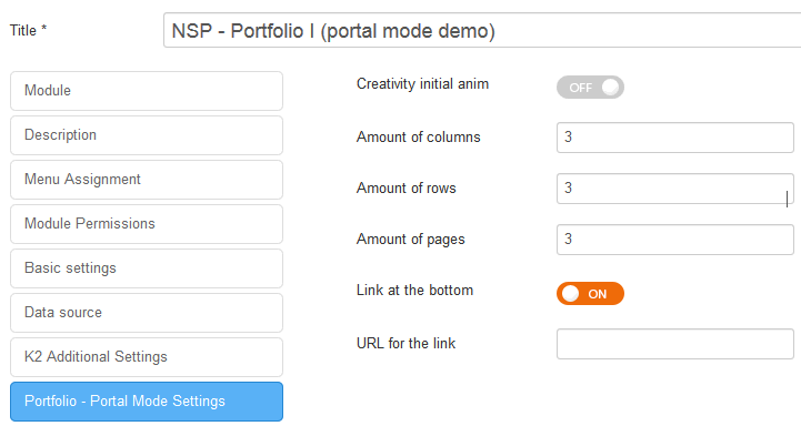
Portfolio I – Portal Mode Settings (tab)
![portfolio_1_mode]()
This style was first time used in GK Creativity template in module named “What we do – We create ideas with passion! See our current works“.
The “Creativity initial anim” – enable this option only on the Creativity template.
The “Amount of columns” – this option specify amount of news columns displayed in the portal mode per page.
The “Amount of rows“- this option specify amount of news rows displayed in the portal mode per page.
The “Amount of pages” – this option specify amount of pages displayed in the portal mode.
The “Link at the bottom” – If you have one page you can disable link (“More work”) at the bottom totally or hide the bottom button after loading all pages.
The “URL for the link” – this option specify the link displayed at the bottom after loading all items.
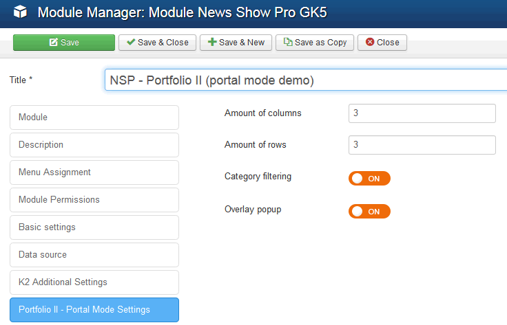
Portfolio II – Portal Mode Settings (tab)
![Portfolio]()
Portfolio II – Portal Mode Settings
The “Amount of columns” option – allows you to specify amount of news columns displayed in the portal mode per page.
The “Amount of rows” – this option specify amount of news rows displayed in the portal mode per page.
The “Category filtering option” – allows to enable the category filtering in the portal mode. You have to select in Data Source tab at least two categories to make sense this feature.
The “Overlay popup” – this option enables the pop-up windows with details after clicking the image.
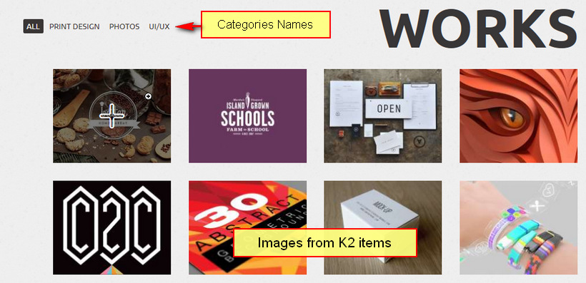
First time we used this style in GK John S. template as you can see at the following image.
![portfolio mode NSP]()
Portfolio II – Portal Mode Settings
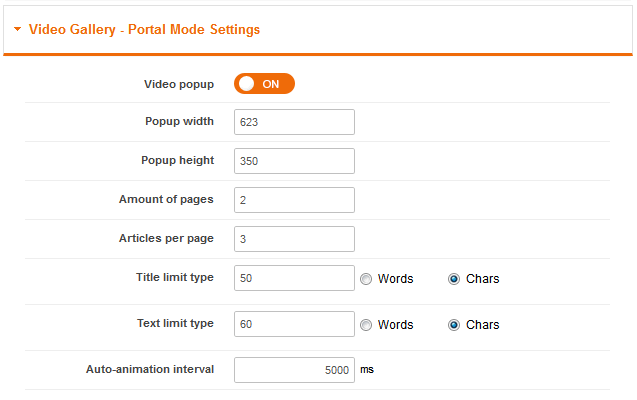
Video Gallery – Portal Mode Settings (tab)
![Video Gallery - Portal Mode Settings]()
Those features allows you to use video from K2 items & present them inside module.
The “Video popup” – you can disable the video popup which is displayed when article contains a video in K2 component.
The “Popup width and height” – allows you to set Popup window size.
The “Amount of pages” – allows you to set amount of pages with articles. When bigger than 1 – then the auto-animation will be automatically enabled.
The “Articles per page” – this option allows you to set amount of articles displayed on one page.
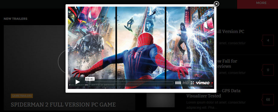
![Appearance of NSP GK5 module set as Video mode in GK Game template]()
Appearance of NSP GK5 module set as Video Gallery mode in GK Game template – after clicking of image
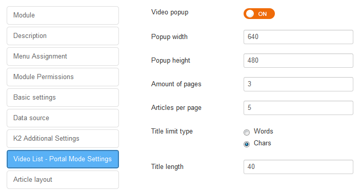
Video Gallery – Video List Mode Settings (tab)
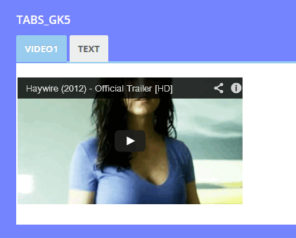
Our latest News 2 template inspired us to create a brand new video portal mode, Video List. Now for example 5 video images can be displayed, and all of them can be clicked to open the video overlay.
![Portal mode video supports News Show Pro]()
Portal mode with video support
It allows you to create a scrollable list of items, which when clicked will display a clean, unobtrusive video overlay provided by the K2 video component. With components other than K2, such as standard Joomla items, normal articles will be displayed without overlays.
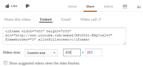
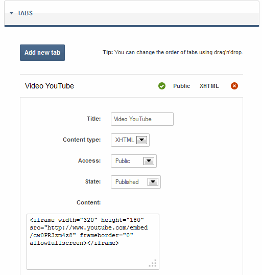
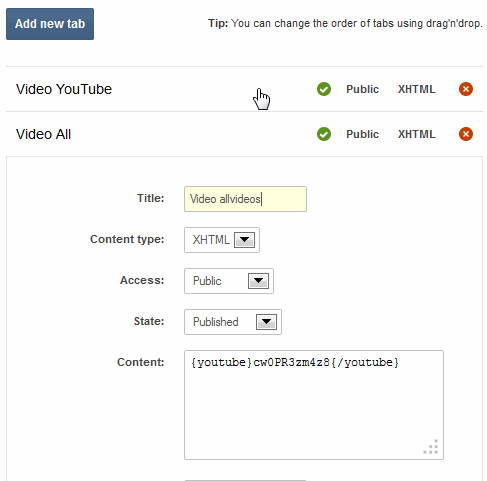
Remember that K2 items must have added video code and images – which are used to show as a screen shots from movies in module. Video in K2 can be added also via All Videos Reloaded plugin, so you can use it.
![Video List - Portal Mode Settings]()
Video List – Portal Mode Settings
The “Video popup” option allows you enable/disable the video pop-up which is displayed when article contains a video in K2 component. When this option will be disabled after clicking on item user will be redirect to item page where he can read whole article and also see movie if it is available.
Options like “Amount of pages” allows you to add pagination with “color dots” under slides. So it’s possible to add much more than 5 videos to the video area, since scrolling buttons have been introduced to slide between different video sets; now you can have 10 or more videos accessible directly on the front page, but load time isn’t affected since the video is only loaded to be played when the image is clicked; until then it works just like a normal news showcase.
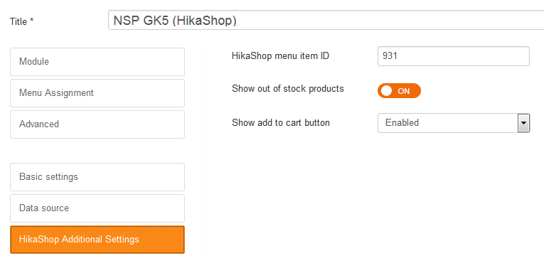
HikaShop Additional Settings (tab)
![Settings for HikaShop - this component must be installed to use this feature]()
Settings for HikaShop – remember that this component must be installed to use this feature
The “HikaShop menu item ID” – you can specify here item ID of HikaShop menu item – used for generating URLs alias – good choice can help your SEO.
The “Show out of stock products” – this option allows you to enable/disable displaying out of stock products.
The “Show add to cart button” – this option allows you to enable/disable displaying a Add to cart in NSP module, which allows users to buy products from it – without going into product page.
RSS Additional Settings
The “RSS Feed cache time” – is used to specify cache time for the downloaded RSS feeds (in minutes). We suggest to use long period of time, for example, 1440 minutes = 1 day.
Article layout settings
This section gives you access to few accordion tabs with setting for article layout.
The “Article pagination” – amount of pages with articles intro, amount of columns & rows and style of pagination.
“The Header” – specify position, floating, link and width limits. The “Image” – allows to setposition, floating and make linkable.
The “Text” – allows to set position, floating, link, text width limits and option to clean HTML code).
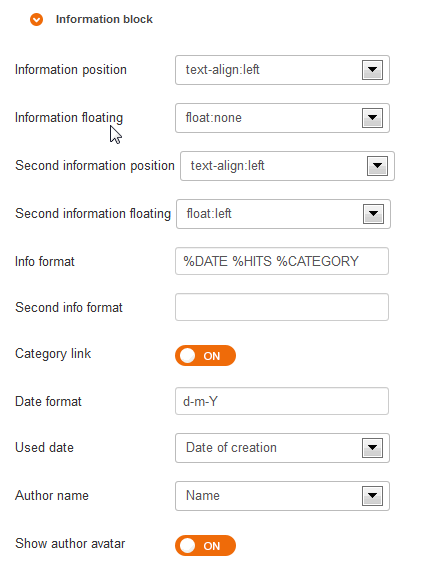
“The Information block” – allows to set position, floating, link, info format based on STRINGS, date and avatar settings. Each article can display two information blocks. For each, we can specify displayed data format.
![info_block_gk5]()
Inside Info format field you can use the following sequences:
- %AUTHOR – displays author name (we choose exact name source in “Author name” option) and avatar from Gravatar.com service (if “Show author avatar” option is on; we specify avatar size in “Avatar size” option) and author link in info block for EasyBlog.
- %CATEGORY – displays category name (we can switch on a link to a category in „Category link” option)
- %DATE – displays article’s creation or modification date (according to “Used date” option), date format is specified in “Date format” option
- %HITS – displays article amount of visits
- %RATE – displays article rate
- %COMMENTS – displays the amount of comments for specific item
- %CART and %PRICE tags – if K2Store component is installed and used.
- %STORE – displays the price and “Add to cart”/”View product” buttons if VirtueMart or HikaShop is installed
The “Article layout” – group of options, there are options connected with elements padding and order of all elements like Text, Image, Info block and also Read more options. It is also possible to switch off each element.
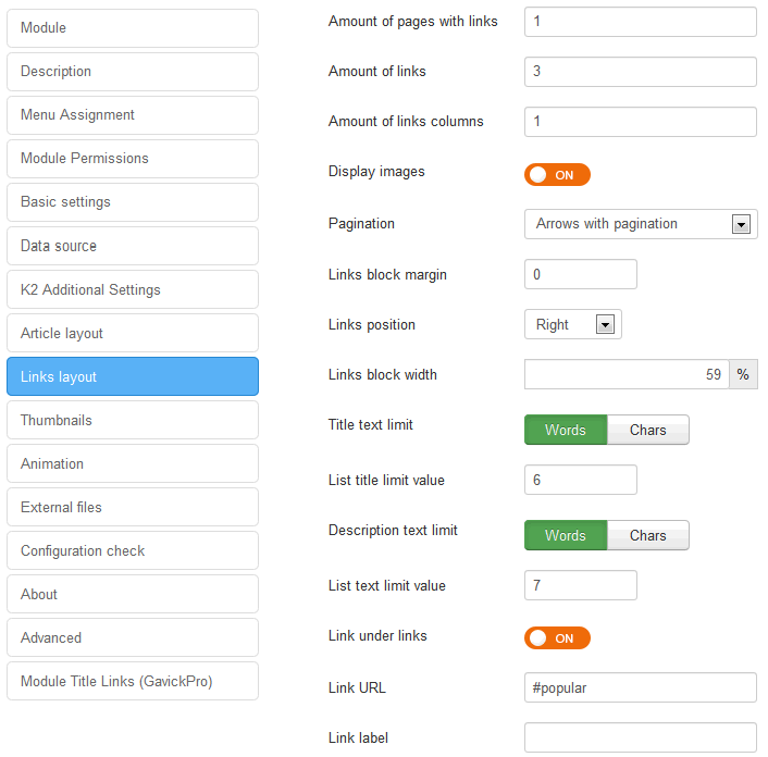
Links layout settings
![Links Layout settings]()
Links Layout settings
The “Amount of pages with links” allows you to specify number of pages with links. If set to 0 it disables pages with links completely.
The “Amount of links” option allows to specify number of links per page.
The “Amount of links columns” option allows to define number of links columns in links section.
The “Display images” option allows display thumbnails (small image) on the left side of the links. You may specify the size of the thumbnails in the Thumbnails section.
The “Links block margin” option allows to define margin for links block as a CSS value, for example, 10px 15px 0px. Additionally, you can specify blocks position towards articles “Links position“. In each link, it is possible to show article’s short description “Show links description” and specify title text limit and its description.
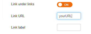
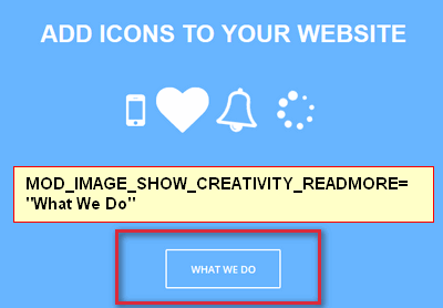
The “Link under links” – this option allows to enable link under links similar as you can see in demo “MORE FROM THIS CATEGORY”. Very often the content of the module is linked to a specific subpage of our website; that’s why we’ve made it possible to add a fully-customizable link (the Link URL field) that may be display under the block of links.
![links under layout]()
In “Link label” field – you can specify the links label, if not, default (“More from this category”) from language file will be used. Check below phrase line from en-GB.mod_news_pro_gk5.ini file:
MOD_NEWS_PRO_GK5_LINKS_TITLE_LABEL_DEFAULT="More from this category"
![Links layout demo with images]()
Links layout demo with small images
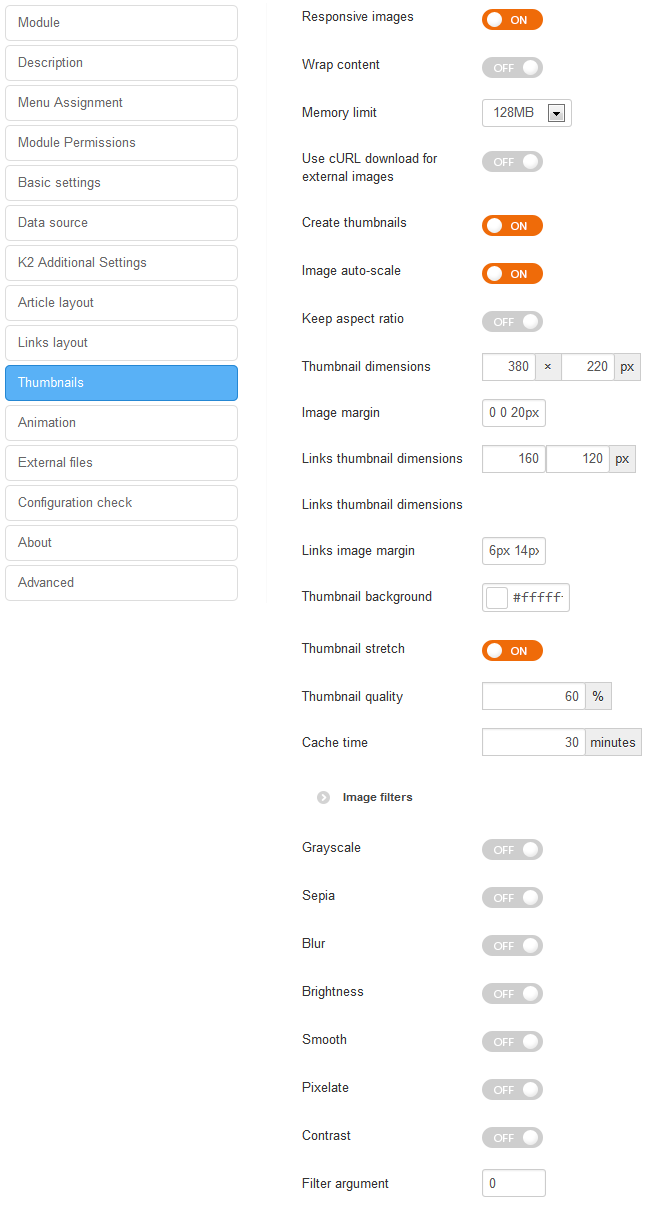
Thumbnails Settings
![thumbnails]()
Thumbnails Settings in NSP GK5
The “Responsive images” – allows you to use all features of the responsive web design layouts, it automatically adapt your module images for mobile devices. When this option is enabled then image always scales up to the 100% width.
The “Wrap content” – enable this option if you want to achieve news layout where the image is at left side and the rest of content is at the right side, then the Image must be set in the article layout as first and should be floated to left.
The “Memory limit” option is useful if you exceed your memory limit during module work or you set the memory limit in the other place to different value.
The “Use cURL download for external images” option is helpful if you have external images or images with absolute paths on the articles and you want to create the thumbnails from these images then you can enable this option. Please remember that you should have permissions to download these images. It will be saved on the cache directory in the downloaded/ catalog. Please remember that first load can take longer time. We don’t recommend to use this option for modules with frequently changing articles, because it can slow the page loading speed due additional data requests.
The “Create thumbnails” option will use PHP GD library to generate thumbnails from article images.
The “Image auto-scale” option will automatically center image and zoom to the specific size. It works only when image stretch and keep aspect ratio options are disabled. If this option is off (disabled) then you will see Image crop settings.
The “Keep aspect ratio” option is useful when you want to keep aspect ratio of created thumbnails. Then thumbnail width and height options mean maximal possible dimensions.
The “Thumbnail dimensions” – option allow you to sets the dimension (width and height) on which the maximum pixel size limitation should apply to for the thumbnail. For the dimensions of your thumbnails you have to find a good compromise: thumbnails with smaller dimensions result in smaller files sizes and therefore the thumbnail page loads very fast. The drawback of small dimensions are obvious: if you pick numbers that are too small, your visitors cannot figure out what will be shown and therefore would not care to click on the thumbnail to read whole article. Set width and height for the thumbnail to the same value – to create square thumbnails.
The “Image margin” – option allows you to sets the margin property for all directions in one declaration (Top, Right, Bottom, Left). Negative values are also allowed. The margin property is supported in all major browsers.
The “Links thumbnail dimensions” – option allow you to sets the width and height for created thumbnails from articles images from Links section.
The “Links image margin” – allows you define margin for images as a CSS value (i.e: 6px 5px 0px 0px).
The “Thumbnail background” – allows you to set background color (in HEX value) under image, this might be important when created thumbnail would be smaller than defined above its size.
The “Thumbnail stretch” – if enabled the thumbnail function stretches the thumbnail’s dimensions, both width and height, to fill the square or rectangle shape defined in the ‘Thumbnail dimensions’ setting.
The “Thumbnail quality” allow you to choose thumbnail quality for generated images, it’s lossy compression method. Lossy means “with losses” to image quality. The more compression level you apply, the more information from photo you’ll lose. Large featureless areas (skies, desert, etc.) compress much better (smaller file) than images containing much tiny detail all over.
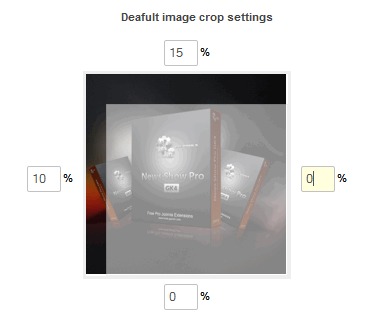
The “Default image crop settings” – where you can specify here the default crop settings for images. These settings will be used if the image doesn’t have duplicates with _noscale and _nocrop settings and if the image isn’t qualified to the crop rules.
![Crop settings]()
Crop settings
The “Crop rules” – you can define two types of crop rules: connected with the class name used in the image and connected with the image size. The first type has following syntax: CLASS_NAME=TOP:RIGHT:BOTTOM:LEFT; where TOP/RIGHT/BOTTOM/LEFT are crop values in pixels. The second type of rules has following syntax: WIDTH:HEIGHT=TOP:RIGHT:BOTTOM:LEFT; where WIDTH and HEIGHT are dimensions of the image to crop.
The “Images filters” – filters are a powerful option that you can use to get interesting visual effects (blurring, grayscale, brightness or contrast etc.), they allow you to visually process an image on the website inside module without needing to go through PhotoShop or Gimp. You can apply an arbitrary number of filters one after the other to achieve all sorts of effects. But at the same time they might have an little impact on the performance of your site. So using them properly will have minimal impact on the speed of your site.
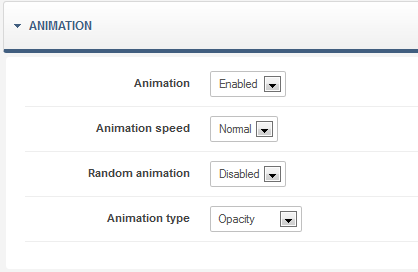
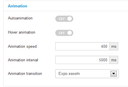
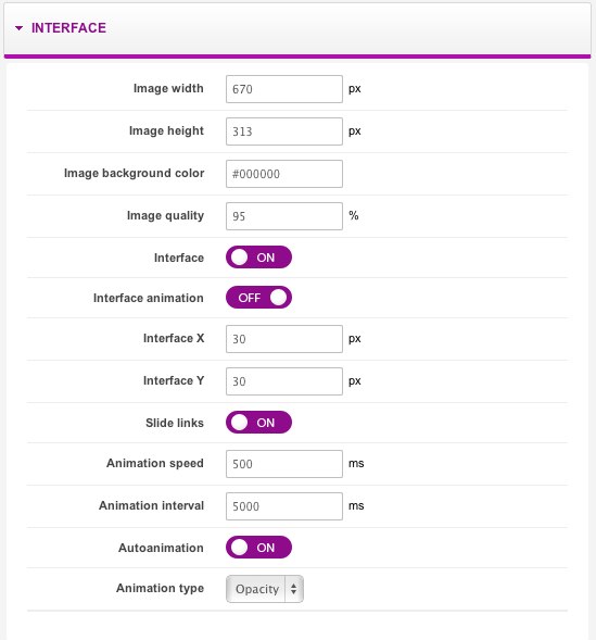
Animation
![animation NEws Show Pro]()
There you will find option connected with Animation effects. If you use “Hover animation” option, it is possible to switch on animation activation after moving a cursor on a pagination button (normally, it requires clicking on this button).
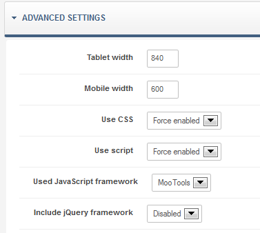
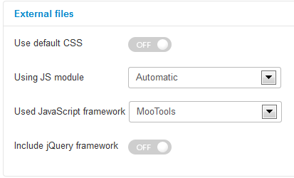
External files
![external-files-gk5]()
The “Use default CSS” – if you enable this option module will start to using default CSS module file.
The “Using JS module” – using engine.js module file.
The “Used JavaScript framework” option allows you to select which JavaScript framework to be used, you can choose between MooTools and jQuery. This option may reduce JS conflicts.
The “Include jQuery framework” option is used to force loading of the jQuery framework by the module if the current template does not contain it.
Configuration check
This simple tool will check if all module configured properly, it will test your GD library configuration, cURL library configuration and cache directory permissions are proper. This option you should check first if you’ll notice a problem with the module.
The post The News Show Pro GK5 Joomla article showcase module appeared first on GavickPro Documentation.